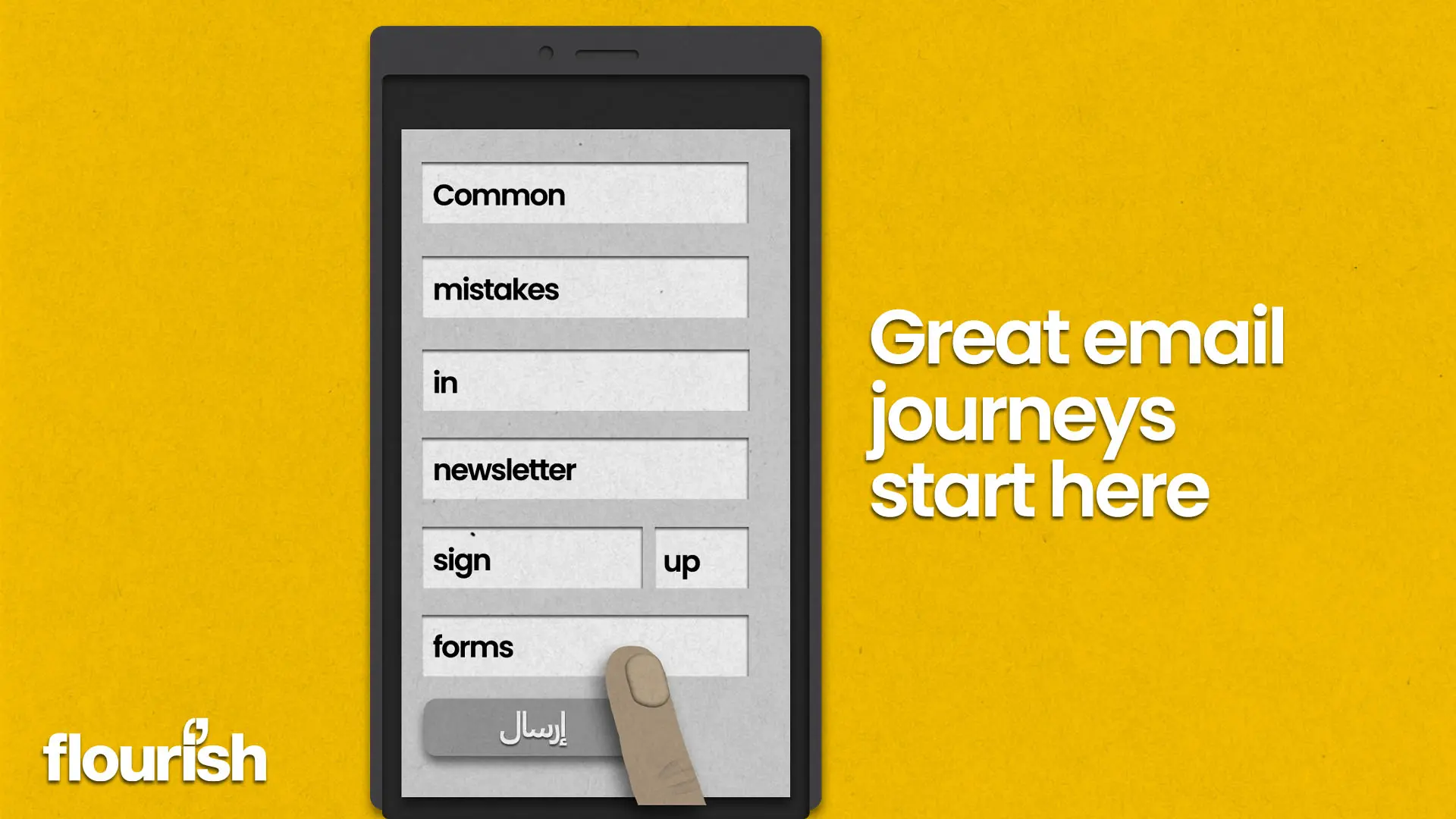
Common mistakes in newsletter sign up forms
By Hussein Alhammad, Lead Developer
Due to my involvement with the Email Markup Consortium and to contribute to its Data Collection project, I signed up to hundreds of email newsletters. Signing up to this many newsletters allowed me to examine how these forms are implemented across a wide variety of sites. So, here are some common mistakes I’ve seen made time and again, along with some other more general observations that could negatively affect user experience.
Mixed languages
Many sites include sign up forms in a language other than the page’s language. The page could be in a central Asian language, but the intro copy of the form and the input field labels would be in English. On many other sites, the form intro copy and input field labels are in the correct language matching the page’s language, but dynamic success and error messages were in a different language.
This is probably the result of not updating the default copy in the sign-up form component or plugin in a framework or a CMS. Or blindly dropping in the example form implementation from the ESP documentation. Either way, making sure language is consistent through your site makes sense.
Email language
Similar to the previous point, emails sent upon signing up to a newsletter do not always match the language of the webpage from which I signed up. This applies to confirmation emails and/or the newsletter email messages. As a user, I would expect the email language to match the language of the webpage containing the sign-up form.
Weirdly, when a sign-up form gives you the option to select the preferred language, the language of the page is not always the preselected option.
Hidden away
On narrow screens (typically a smartphone), the sign-up forms on many e-commerce sites are well hidden, making them difficult for users to find. Common hiding spots include inside a collapsed accordion in the footer of the page or at the bottom of navigation links inside a burger menu. If you want people to sign up, make your form visible.
Blind pop ups
Many sites nowadays display a pop-up sign-up form for first time visitors. Regardless of what you think of them, if implemented correctly, they can be effective. What doesn’t make sense though, is to display this pop-up form on your dedicated newsletter sign-up page.
Other pop-ups are truly blind. I have found myself halfway through filling out an online sign-up form and been interrupted by a pop-up telling me to sign up through a different form.
Zero or delayed feedback
On many sites, upon hitting that “subscribe” or “submit” button you get zero feedback. There is sometimes no indication of whether there were errors the user may need to fix or whether the form has been submitted successfully.
On some sites, I did eventually get a success or error message, but it frequently took several seconds, with no indication that the form submission was being processed.
Email address field
There are many input field types in HTML.
Many forms use a basic text input field instead of the email input field when they ask for an email address. From the user’s perspective, there’s no visual difference. However, this could mean that there is no way to identify if the user has entered their email incorrectly, or give their device a chance to pre-load suggestive answers.
In general, a browser’s autocomplete suggestions can be influenced by the input type, and true to both desktop and mobile browsers. Using the email input field specifically, means the browser would provide the most useful suggestions to the user.
On-screen keyboards, particularly on smartphones and tablets, automatically adjust based on the input field type. When it comes to an email input type, the keyboard would typically default to lowercase characters. If multiple input languages are enabled on a phone, the keyboard may automatically switch to English instead of defaulting to the last used language. The layout of the keyboard may also be optimised for inputting email addresses. And lastly, the autocomplete behaviour of the keyboard may change to omit the addition of a whitespace character after selecting the suggested word (the extra whitespace may result in a validation error on some forms).
While subtle, these on-screen optimisations can help the user to quickly and easily complete the form.
Email field trailing whitespace
If a trailing whitespace is present in the email input field, the validation rules of many forms would not allow submission here due to an invalid email address. This can be confusing and unclear to the user. Form validation should automatically trim whitespace characters from the start and the end of field values instead of asking the users to manually fix their input without explicitly telling them what to fix.
RTL page, RTL fields
Many RTL (Right-To-Left) sites do not reset the text direction on input fields including fields that are known to only accept LTR (Left-To-Right) input such as email address and phone number fields. The fields remain functional, but it’s an odd experience, and totally fixable.
Chain tabs
I ran into this more than once. I have seen many sign-up forms asking for an email address only. I fill out a form and submit it. I am taken to a new page in a new browser tab, only to find that the page contains a longer form. I fill out the long form and submit it and I am taken to yet another page in another browser tab. The last page is typically an external confirmation page hosted by the ESP. Make sign ups simple.
As 2023 approaches, marketers should be delivering the best possible customer experience. There are no real reasons why you can’t take advantage of all the available tools and innovation to ensure a smooth and enjoyable customer journey. If you need some help with improving your sign-up forms and overall approach to email marketing, talk to Flourish and our specialist team will be happy to help you out.