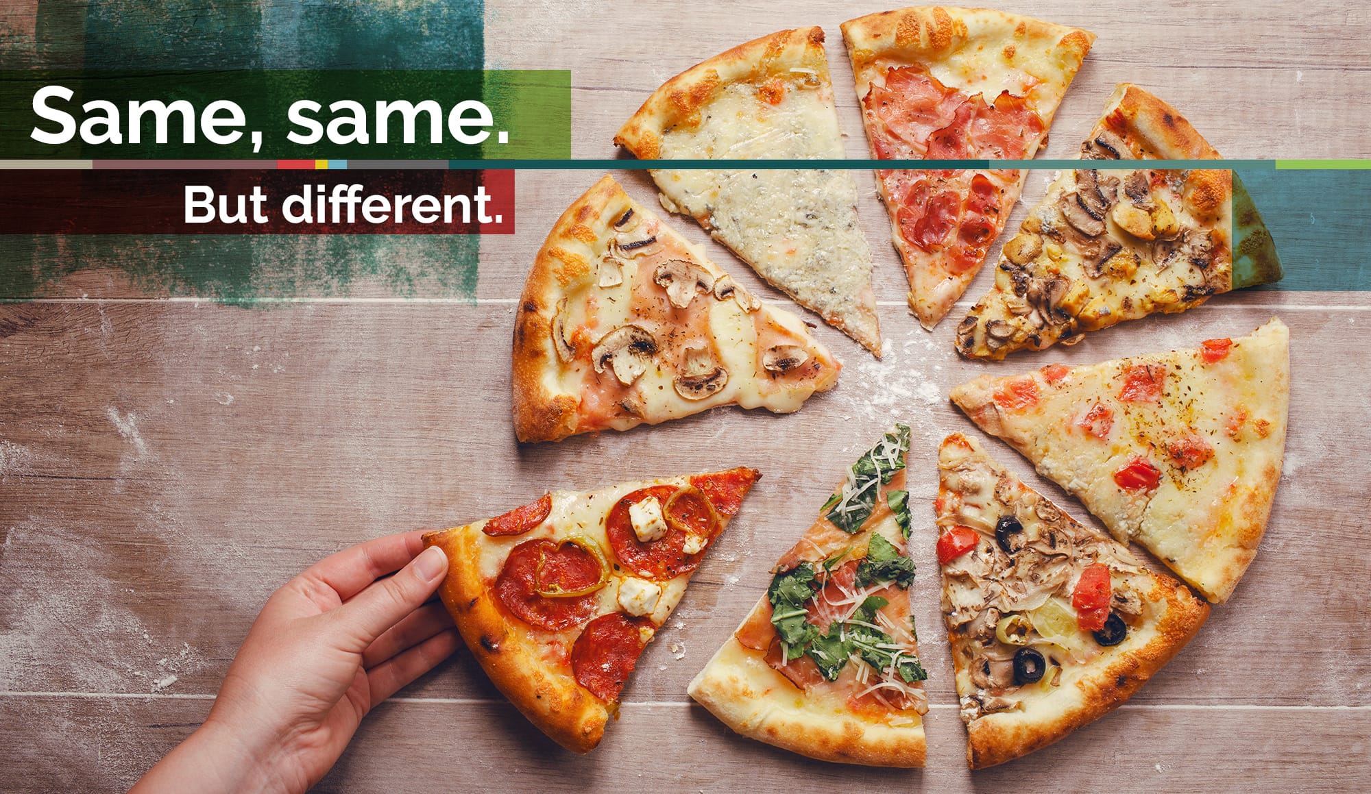
Emails don’t need to look identical in every inbox
We write, design, build and send around 400 million emails a year. That’s the equivalent of an awesome email for 1 in every 20 people in the world. So yeah, we know a thing or two about email. And (set faces to stunned), we don’t care one bit if they look different in email clients. Shock and horror.
Of course, we do insist every email is AWESOME down to the very last pixel. But not all email clients can cope with the sheer technical wizardry our dev guys summon. So we bend the rules. Create workarounds. Adapt how we build. We never shoehorn the same email into every inbox. And that takes a lot of testing.
Not all email clients have the same mail server, pre-processor or rendering engine. And email doesn’t allow the luxury of design that websites do. So we have our work cut out, but it doesn’t stop us pursuing and delivering seamless email campaigns for the likes of Samsung. And a lot of that is down to using progressive enhancement to improve user experience.
What’s ‘progressive enhancement’ when it’s at home?
Progressive enhancement is pretty much what it sounds like; a way of using new technology to enhance a user experience. For email, that means using advanced CSS to ensure every inbox gets the best possible email experience. From simple things like rollover states on buttons, to advanced features like content shake and progressive load in email – no CSS stone goes unturned.
And the result is pretty comprehensive. We see longer engagement and better click through rates when these techniques are used. It means some of our comms look different in across clients, but when emails look this silky, who cares?